Cartography and Design
From the earliest cave markings to carved stick charts and drawn maps, early humans relied on visual tools to communicate complex ideas. Where to find water, how to travel safely, or what dangers to avoid were too critical to leave to memory alone. Early maps served as powerful forms of storytelling and communication, passing knowledge across generations. They transformed lived experience and spatial awareness into shareable formats others could see, interpret, and act upon. In this way, maps were among humanity's first acts of design: an intentional shaping of information into a visual form with the goal of guiding others.
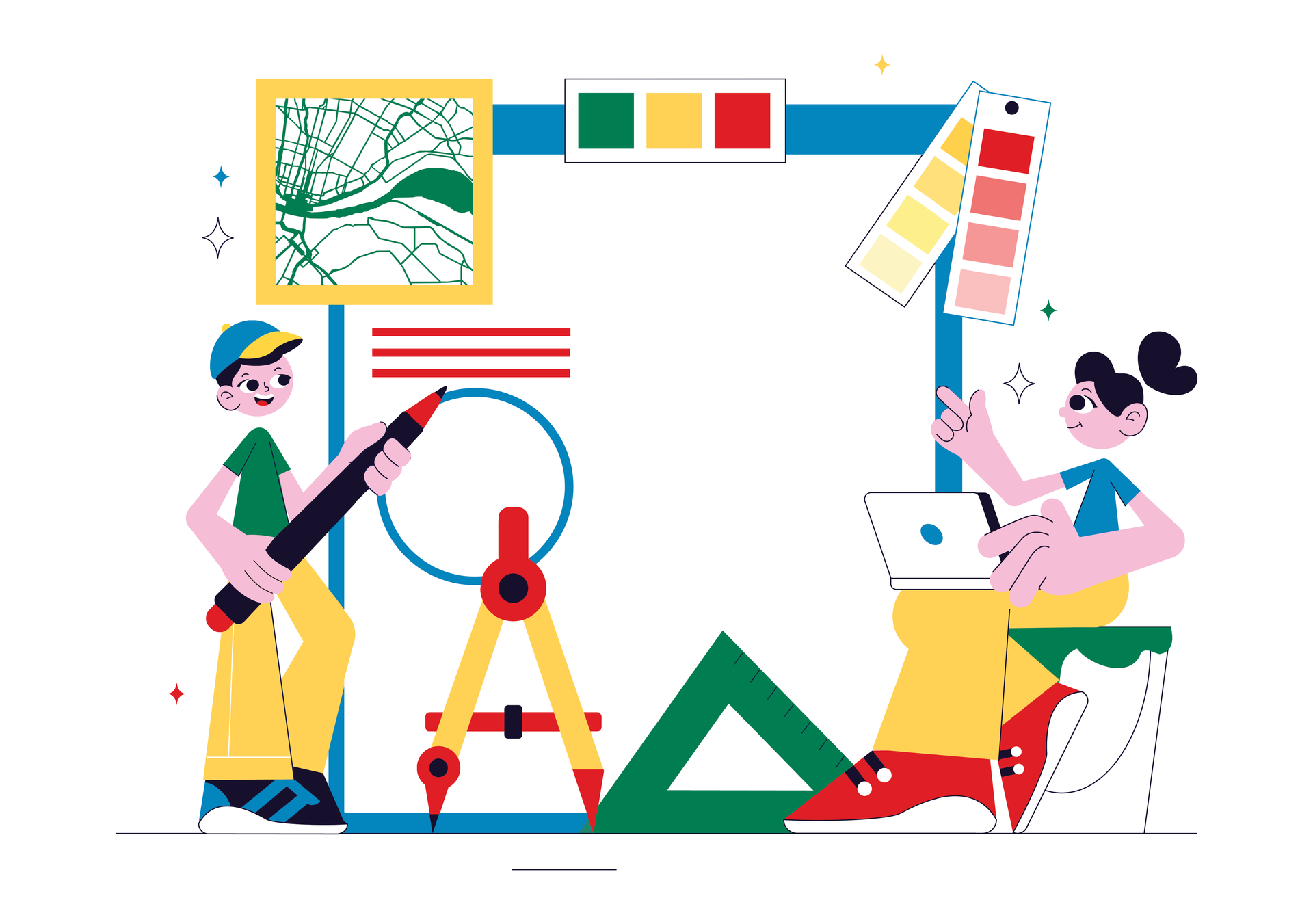
I view cartographers as 'specialized designers' because effective cartography requires more than technical accuracy; it requires a grasp of design fundamentals. The seven principles of design—emphasis, balance, contrast, repetition, proportion, movement, and white space—are as crucial to mapmaking as they are to branding, illustration, or interface design. A map without balance may overwhelm the eye. A map without contrast may bury its most important features. And a map without thoughtful emphasis risks leaving users unsure of what matters most. In this sense, every map is a designed object, and every cartographer is a designer working within a highly specific medium.
Yet the connection between cartography and design runs deeper than shared principles. Both fields are fundamentally user-centered. A graphic designer considers how a person will navigate a website, comprehend an infographic, or connect with the visual identity of a brand. Similarly, a cartographer anticipates how a user will interpret a route, identify landmarks, or assess the terrain of a landscape. In both practices, success depends on empathy: understanding what the user needs, predicting where they might struggle, and creating visual language that guides them intuitively toward clarity.

Cartography, then, is more than a technical exercise in representing geography. It is a creative discipline rooted in problem-solving. Every choice, from the thickness of a line to the hue of a color palette, shapes how information is perceived and used. For example, a designer might choose warm colors to draw attention to urgent information, while a cartographer might use the same approach to highlight areas of risk on a hazard map. Just as a poorly designed interface can frustrate or confuse its users, a poorly designed map can mislead, overwhelm, or even endanger. Conversely, a well-crafted map inspires confidence, encourages exploration, and conveys information in ways words alone cannot.
The narrative power of maps also underscores their kinship with design. A brochure or advertisement might tell the story of a company or product, while a map tells the story of a place, a journey, or a phenomenon. A transit map, for instance, communicates how a city functions and how people move through it. A thematic map illustrating the spread of disease doesn't just record numbers; it tells a story of urgency, patterns, and human impact. In both design and cartography, the aim is not only to present data but to frame it in a way that resonates emotionally and intellectually with the audience.
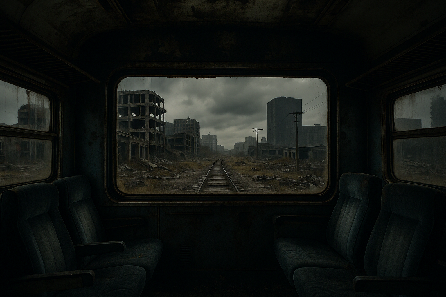
By recognizing cartographers as specialized designers, we acknowledge the artistry behind the science. Maps are not static records of geography. They are purposeful visual narratives that bridge raw data and human experience. Whether guiding a traveler through a city, helping emergency responders in a crisis, or preserving cultural memory, effective cartography balances accuracy, aesthetics, and accessibility.
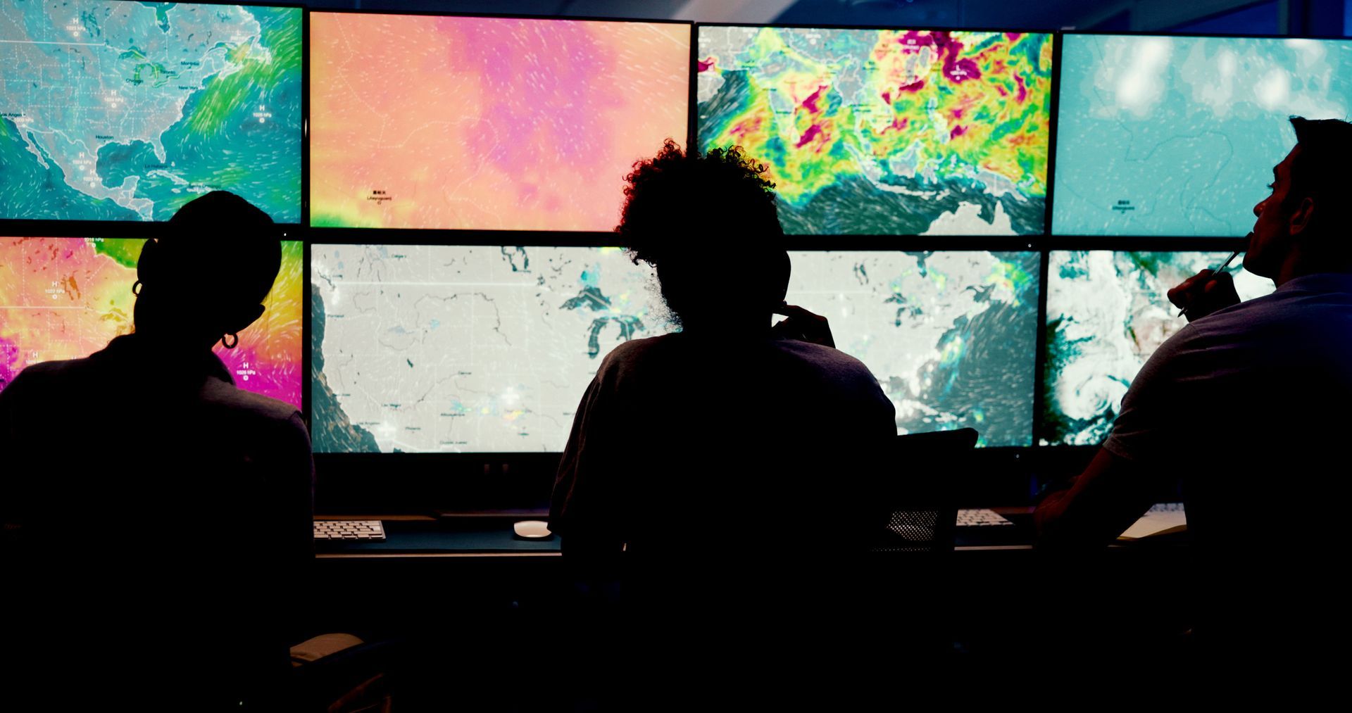
In today's world, where data visualization plays an ever-growing role in how we understand complex systems, the overlap between design and cartography is more relevant than ever. Digital mapping platforms, interactive dashboards, and immersive geographic visualizations rely on the same design principles as traditional print media. Both fields are tasked with making complexity simple, translating overwhelming amounts of data into experiences that are usable, memorable, and meaningful.
Cartography and graphic design share a common purpose: to help people see, understand, and connect. They are disciplines united by empathy, clarity, and storytelling. Qualities that ensure their enduring value in a world where visual communication is more important than ever. Maps, like all great designs, are not just about looks, but how they help us understand and engage with the world we live in.